ShopDreamUp AI ArtDreamUp
Deviation Actions


Suggested Collections


Description
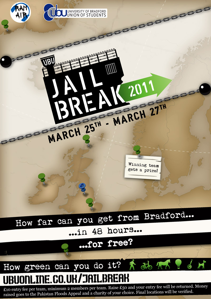
University of Bradford, like most unis, has a Student Union that puts on plenty of events. While their website and posters are vibrant and full of colour, they also make me feel a bit ill with their colour choices and production values.
So, my latest target: An unofficial redesign for their "Jailbreak" logo and poster (see their 2010 offerings on their site here).
...perhaps I went a little overboard with the brown, but it's meant to vaguely resemble those old treasure maps. It also allows people to focus on the information over it, with its prison themed decoration.
Update: Put in the new 2010/2011 union and radio station logos. Changed the charity from Haiti to Pakistan.
Image size
800x1131px 238.58 KB
Comments2
Join the community to add your comment. Already a deviant? Log In
A vast improvement indeed. and all round nice work.